Hip Kit Club: Creating a Double Pocket Page for Christmas

Earlier this month I told you about how I was avoiding our Covid Christmas photos from 2020 because they just didn’t seem to have the same excitement as a ‘normal’ Christmas. My solution was to create pocket pages and it has worked out great! The ADORABLE products in the November 2023 Hip Kits help to connect my random photos together and add that seasonal sparkle.

Today I’m sharing the next spread in this series … a double-pocket page. To see the process, watch the video below! Or scroll down to view the photos.

CHRISTMAS TIME

The first thing I do when I am creating a double-pocket page is to decide where my photos are going to go and what size I will be printing them. I tend to print them smaller, as opposed to placing a full-photo in a pocket, because I like to place patterned paper behind the photos. The colors and patterns of the papers are what makes my creative heart HAPPY!
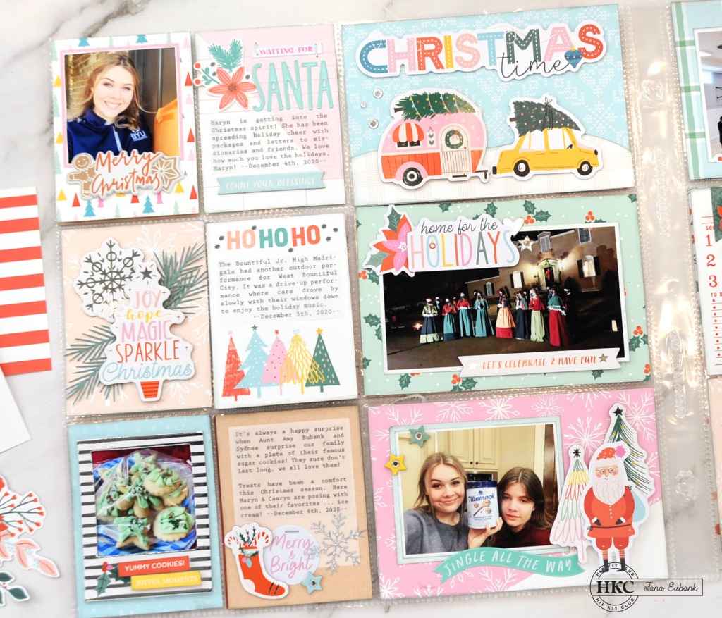
I make sure to leave lots of empty spaces between the photos so that I have room for journaling and embellishing. Next, I decide what cards will go in each pocket, making sure to balance the colors and patterns throughout the double-page spread.

Embellishing is my FAVORITE! (I’m sure you have figured that out already. Ha!) I always have fun with the Hip Kit Club embellishments because there are so many textures and finishes to mix together which make it so interesting to look at.

I tend to think in ‘layers’. Stamping in different colors of ink directly on the card or layering paper are the ‘flat’ layers. Next, I add dimension with chipboard and cardstock die-cuts that are popped up with thin foam dots. The ‘top’ layers are things that are sparkly or have more dimension to them, like puffy stickers, gems, enamel dots, buttons, or trim.

I make sure to add a title card to each spread and incorporate a good balance of words and images. Cutting images using metal die-cuts adds a ‘custom’ feel to your projects. For example, the pine sprigs on this layout add so much true-to-life texture. LOVE it!

I like to treat each card as it’s own little layout. I try to make sure I include different textures on a single card.

Every photo on your pocket page spread doesn’t have to be perfect. In fact, that is the beauty of pocket pages. They are a good place to add the more casual snapshots that we take on our phones that probably wouldn’t warrant a full scrapbook page, but still help to capture daily stories.

For example, my daughter’s eyes in the photo below look droopy, but it was still fun to capture my girls love for ice cream to comfort their souls during this strange and different covid Christmas, so I included it anyway.

Don’t be afraid to just have fun decorating cards to fill the spots. On this page, I decorated three of the 3×4 cards with large die-cuts and stickers. They make your spread more decorative and give a place for the viewer’s eye to rest.

I get asked a lot how I print on my journal cards. There are many people who run their cards directly through their printers by attaching them to type paper. I don’t do that. It stressed me out to much! *giggle* I simply print my journaling on thin vellum, then adhere the vellum directly to the card. Once the card is inside the pocket page, you barely notice the additional layer of vellum. It blends right in!

Journal pocket cards don’t have to be just for journaling. I used a 3×4 card here to anchor my fireplace sticker. (it almost looks like the floor and trim to the room, don’t you think?) I also used a 4×6 ‘week-at-a-glance’ journal card as the background for a photo. Check it out below!

Another way to add texture to a layout or pocket card, is by using paperclips or staples. Here you can see I used mini staples in several spots to accent different areas. The silver color of the staples ties in with the silver foil puffy stickers.

The Pocket Life kit includes a variety of card sizes; 3×4, 4×6, 3×6, and 3×8. I cut some of the longer cards down to the 3×4 size. I also created my own cards with the 6×8 papers from the Pocket Life Kit, or the 12×12 papers from the Cardstock Kit and Main Kit.

Here is one more look at each page of my double-page spread. I LOVE the way it turned out!

I hope you’ve enjoyed seeing my take on pocket page layouts this month! Pick up the ADORABLE November 2023 Hip Kits at the links listed below.

Thanks for coming by!

NOVEMBER 2023 HIP KITS USED IN THIS PROJECT:

JanaBold

JanaEubankYouTubeIcon JanaEubankIconFacebook JanaEubankIconInstagram JanaEubankIconPinterest

Scrapbook & Cards Today Magazine: First Day of School

Let’s add lots of lovely layers to our page today! Hi friends! Today I’m sharing the process video for a layout I created for the Fall issue of Scrapbook & Cards Today Magazine using the beautiful Die Cuts with a View ‘Pocket Full of Flowers’ paper pad.

FIRST DAY OF SCHOOL

I have always loved the fall and going back to school and I especially love seeing the ‘First Day of School’ photos of everyone’s kids. Their eyes are always so full of excitement and hope for a fun-filled year ahead.

I give you lots of tips for selecting patterned papers for your layers in the video, but the main thing you want to look for is contrast. Contrast in colors, pattern, scale, etc. Here you can see I have graphic patterns, like the polka dots and grid, mixed together with florals.

I created my own title using letter stamps and dies. The tile letters were created with the Lawn Fawn ‘Claire’s ABCs’ stamps. The ‘school’ word was created using the Scrapbook.com Bold Basics dies with Simple Stories Cornflower cardstock. I layered contrasting color behind the openings of the letter ‘o’s for a splash of color.

Working with paper pads can be tricky sometimes because there usually aren’t coordinating embellishments to purchase to go along with the patterned papers. For this layout I fussy-cut larger images from the ‘Pocket Full of Flowers’ papers to create embellishments. I used the pocket, water pitcher, and phrase from the cut-apart sheet, then, fussy-cut the butterflies and flowers from patterned papers.

Layer together two butterflies of the same size with thin foam tape. Fold up the wings of the top butterfly to create a dimensional look.

Here I layered together several single flowers to create my own flower cluster. This is a great way to balance colors on your page and create a custom look.

I hope you enjoyed seeing all of the ways you can add layers to your scrapbooking using patterned paper. Will you be giving these techniques a try?

JanaBold

SUPPLIES USED IN THIS PROJECT:

JanaEubankYouTubeIcon JanaEubankIconFacebook JanaEubankIconInstagram JanaEubankIconPinterest

Scrapbook Organization: How I Set Up My Hip Kit for a Month of Scrapbooking

Each month I set up my Hip Kit Club kits on my desk so that I can create with them all month long. Recently I’ve purchased some new organization tools and have been enjoying how they help me to keep everything neat, tidy, and visible. Watch the video below to learn more!

As my older children have moved out on their own, I’ve been able to use one of their rooms for filming my scrapbook process videos. In that room, I have a large 4′ x 7′ island where I work. This was purchased from a local cabinet maker who made a mistake on an order. I love the drawers for my tools and the shelf underneath, where I have baskets holding my most recent scrapbooking supplies.

I am able to keep my cameras, lights, and filming supplies up all the time in this room, which has really come in handy. I keep the most current kits from Hip Kit Club on the left side of the island in the organization tools that I’ll be sharing with you today.

All products are linked in my Amazon Influencer Shop HERE. You can also find the link at the top of my website under the ‘Products I Love’ tab.

SHOP for the August 2023 Hip Kits HERE.

Learn more about SUBSCRIBING to the Hip Kit Club HERE.

Let me know if you have any questions!

JanaBold

JanaEubankYouTubeIcon JanaEubankIconFacebook JanaEubankIconInstagram JanaEubankIconPinterest

Hip Kit Club: Mood Board Challenge

There you are, staring at your supplies. They’re beautiful, but you’re unsure about how to get going on your next scrapbook page. Give a mood board challenge a try! Today, I’m sharing my latest layout using the May Mood Board Challenge by Hip Kit Club.

How do you use a mood board? Well, that is up to you! Look at the photos on the mood board and use the colors, shapes, and textures to guide your design decisions. In my video below, I will explain how I used the April 2023 Hip Kits and this mood board to create the ‘Mermaid Tale’ layout shown below.

MERMAID TALE

I began this page with the top three mood board photos as inspiration. I loved the purple and blue colors mixed with many florals spilling out of the baskets and buckets around the bicycle. I decided to create a column of photos surrounded by lots of soft, pretty flowers.

Before assembling my layout, I used the bottom two photos on the right as inspiration to add tonal stamping to the background paper. Here you can see where I used the Coffee Stain stamp and the Mini Postage Stamp Texture stamp (April Embellishment Kit) on the purple patterned paper.

I stacked my photos and then used florals created with the October 2022 Color Kit along with black and white floral die-cuts (April Main Kit) and clear stickers (April Embellishment Kit) to spill out from behind. (NOTE: The stamped florals were left over from my last Hip Kit Club layout – watch the video HERE if you’d like to see how I made these flowers using inks, embossing ink, and drips of water & paint.)

I also added pieces of flowers along the top-right edge of the page. The flower centers are dotted with the Lemon Twist Nuvo Drops from the April 2023 Color Kit.

To the right of my photos column, I used a 6×4 Journal Card from the April Pocket Life Kit to house my title and journaling. I was inspired by fellow design team member, Sophie Delorme, to add the Pixie Wings Nuvo Glacier Paste (April Color Kit) to the navy chipboard letters (April Main Kit) for a shimmery, mermaid feel. I also dabbed the Glacier Paste onto several of the flowers.

Below the journaling I added a section of scalloped patterned paper because it reminded me of fish scales, tying into the theme of my page.

All the elements together create a layout that makes you feel like you’re swimming through an underwater seascape. I love it!

If you haven’t picked up the April Hip Kits yet, you can find them HERE. Enjoy!

APRIL 2023 HIP KITS USED IN THIS PROJECT:

JanaBold

JanaEubankYouTubeIcon JanaEubankIconFacebook JanaEubankIconInstagram JanaEubankIconPinterest