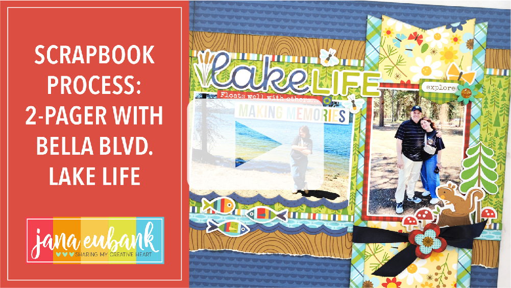
I mostly create single-page scrapbook layouts, but double-page layouts are my go-to when documenting a vacation! Today I am sharing a 2-page layout that I created for the Winter 2023 issue of Scrapbook & Cards Today magazine using the adorable Bella Blvd. Lake Life collection.
LAKE LIFE
The assignment was for a column where we were sharing our favorite memory of 2023. Being in the mountains with my family is heavenly, so I chose to create a layout about a getaway my family took to McCall, Idaho, on the shores of Payette Lake.
Bella Blvd. collections are always so happy and bright. I love working with them and have the most fun choosing all of the die-cuts to decorate my project.
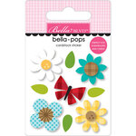
There are always so many cute critters … my favorite! And the Bella Pops with their glossy, epoxy details and layered look are the perfect way to king things up a notch!
The die-cut packs are HUGE! I love using the elements to create little scenes around my layout.
There are so many title options in the Ephemera-Words pack … and they are generously proportioned making them perfect for scrapbooking!
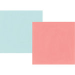
I also really love that the collection kits include TWO of each paper … perfect for those who LOVE creating double-page layouts or those who love to collect patterned paper. *raising my hand high*
The mountains are my favorite place to be … I will definitely be using this collection over and over. LOVE it!
Where is your favorite place to spend time with your family?
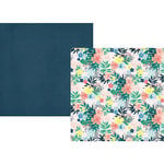
Earlier this month I told you about how I was avoiding our Covid Christmas photos from 2020 because they just didn’t seem to have the same excitement as a ‘normal’ Christmas. My solution was to create pocket pages and it has worked out great! The ADORABLE products in the November 2023 Hip Kits help to connect my random photos together and add that seasonal sparkle.
Today I’m sharing the next spread in this series … a double-pocket page. To see the process, watch the video below! Or scroll down to view the photos.
CHRISTMAS TIME
The first thing I do when I am creating a double-pocket page is to decide where my photos are going to go and what size I will be printing them. I tend to print them smaller, as opposed to placing a full-photo in a pocket, because I like to place patterned paper behind the photos. The colors and patterns of the papers are what makes my creative heart HAPPY!
I make sure to leave lots of empty spaces between the photos so that I have room for journaling and embellishing. Next, I decide what cards will go in each pocket, making sure to balance the colors and patterns throughout the double-page spread.
Embellishing is my FAVORITE! (I’m sure you have figured that out already. Ha!) I always have fun with the Hip Kit Club embellishments because there are so many textures and finishes to mix together which make it so interesting to look at.
I tend to think in ‘layers’. Stamping in different colors of ink directly on the card or layering paper are the ‘flat’ layers. Next, I add dimension with chipboard and cardstock die-cuts that are popped up with thin foam dots. The ‘top’ layers are things that are sparkly or have more dimension to them, like puffy stickers, gems, enamel dots, buttons, or trim.
I make sure to add a title card to each spread and incorporate a good balance of words and images. Cutting images using metal die-cuts adds a ‘custom’ feel to your projects. For example, the pine sprigs on this layout add so much true-to-life texture. LOVE it!
I like to treat each card as it’s own little layout. I try to make sure I include different textures on a single card.
Every photo on your pocket page spread doesn’t have to be perfect. In fact, that is the beauty of pocket pages. They are a good place to add the more casual snapshots that we take on our phones that probably wouldn’t warrant a full scrapbook page, but still help to capture daily stories.
For example, my daughter’s eyes in the photo below look droopy, but it was still fun to capture my girls love for ice cream to comfort their souls during this strange and different covid Christmas, so I included it anyway.
Don’t be afraid to just have fun decorating cards to fill the spots. On this page, I decorated three of the 3×4 cards with large die-cuts and stickers. They make your spread more decorative and give a place for the viewer’s eye to rest.
I get asked a lot how I print on my journal cards. There are many people who run their cards directly through their printers by attaching them to type paper. I don’t do that. It stressed me out to much! *giggle* I simply print my journaling on thin vellum, then adhere the vellum directly to the card. Once the card is inside the pocket page, you barely notice the additional layer of vellum. It blends right in!
Journal pocket cards don’t have to be just for journaling. I used a 3×4 card here to anchor my fireplace sticker. (it almost looks like the floor and trim to the room, don’t you think?) I also used a 4×6 ‘week-at-a-glance’ journal card as the background for a photo. Check it out below!
Another way to add texture to a layout or pocket card, is by using paperclips or staples. Here you can see I used mini staples in several spots to accent different areas. The silver color of the staples ties in with the silver foil puffy stickers.
The Pocket Life kit includes a variety of card sizes; 3×4, 4×6, 3×6, and 3×8. I cut some of the longer cards down to the 3×4 size. I also created my own cards with the 6×8 papers from the Pocket Life Kit, or the 12×12 papers from the Cardstock Kit and Main Kit.
Here is one more look at each page of my double-page spread. I LOVE the way it turned out!
I hope you’ve enjoyed seeing my take on pocket page layouts this month! Pick up the ADORABLE November 2023 Hip Kits at the links listed below.
Do you enjoy creating double-page layouts? They come in handy when you have lots of photos of an occasion, or even when you would like more space to add a long story. Today, I’m sharing a double-page layout that I created for the Fall issue of Scrapbook & Cards Today Magazine using the Die Cuts with a View ‘Humble Abode’ paper pad.
HOME AWAY FROM HOME
One of my favorite strategies for creating continuity on a double-page layout is repeating similar elements across both sides of the layout. You can do this by using patterned paper, embellishments, color, and shapes.
The title is created using an alphabet stamp/die set by The Stamp Market. I love that I was able to customize the colors with embossing powder to match the navy/pale blue background paper.
All of the ’embellishments’ on this layout were fussy-cut from the patterned papers. If you are unsure of how to use large-scale patterned paper, try cutting out the images and using them as die-cuts for your projects.
I created my journaling on the computer, then cut it out using a series of oval dies by Cottage Cutz. I used Adobe Illustrator to create an oval text box the same size as the oval die so that everything matched up perfectly.
Stitching and tiny, clear gems add texture to this page.
When is the last time you created a double-page layout?
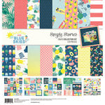
Four years ago my family checked off a bucket list item when we took our summer vacation to the Outer Banks in North Carolina. We stayed in a beach house and/ spent our days playing in the ocean, collecting shells, and eating good food. It was amazing! The Simple Stories Sunshine & Blue Skies collection, with its sunkissed vibe, was perfect for scrapbooking all of the beach photos I took while we were there!
I pulled out the Say Cheese 4 Fun Words Large Metal Dies to create my title. I die cut the title three times. Two layers are from Navy/Emerald paper, and the third layer is from the navy dot side of the Let’s Escape paper. I layered them all together with foam tape to give the title lots of dimension.
I used dies from my stash to compliment the Sun die cut at the top of the page. I used foam tape to add a couple of leaf stickers and a phrase from the Combo Sticker Sheet.
This embellishment cluster on the right page was a lot of fun to create. I love combining die cuts in an “L” shape to accent the corner of my photos. I also added another die cut word to this side, as well, accenting it with the hexagon umbrella shapes from the collection, phrase stickers (4×6 Stickers), and that super-cute, polaroid camera sticker!
I love how beachy this collection feels! It was the perfect way to document our beach adventure on the East Coast!