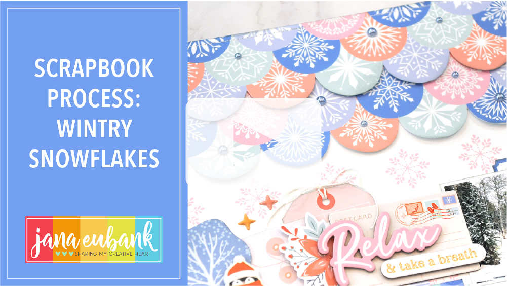
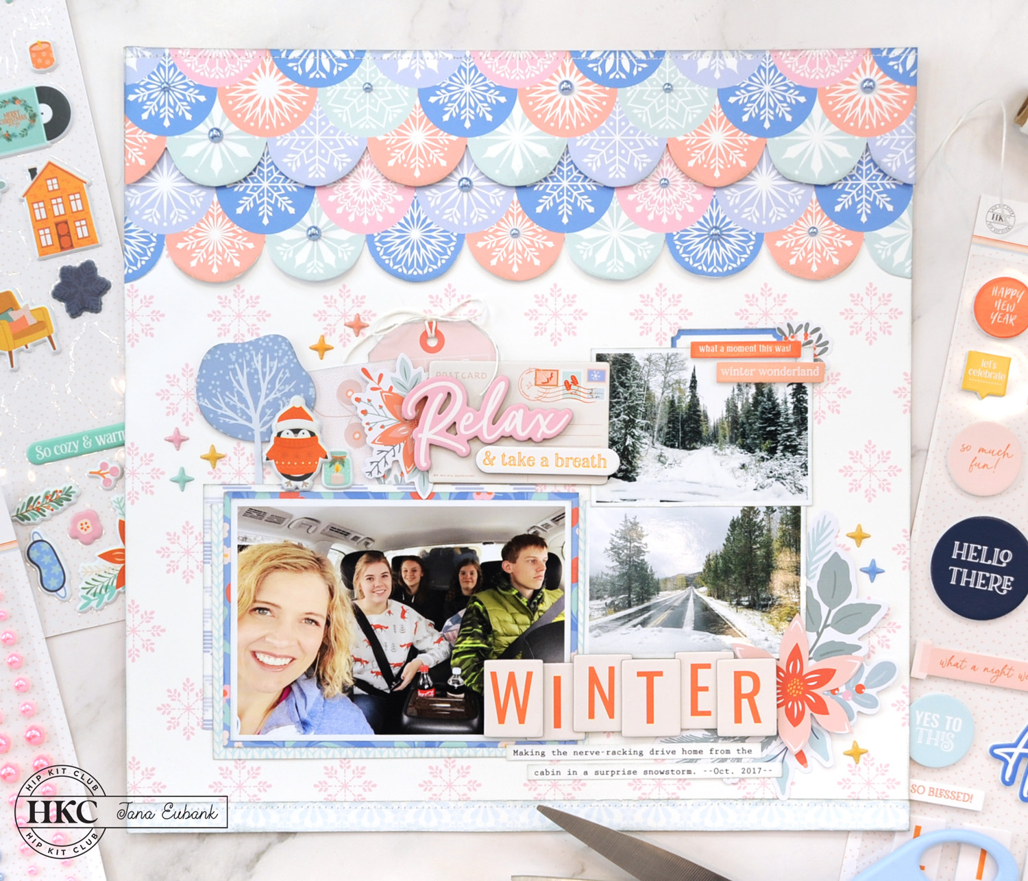
Hello! I hope you are staying warm & cozy inside and getting lots of scrapbooking done during these cold winter months. I’ve been playing with the December 2023 Hip Kits and have a new layout to share. This one is full of lots of snowflakes and was so fun to make. Check it out below!
WINTER
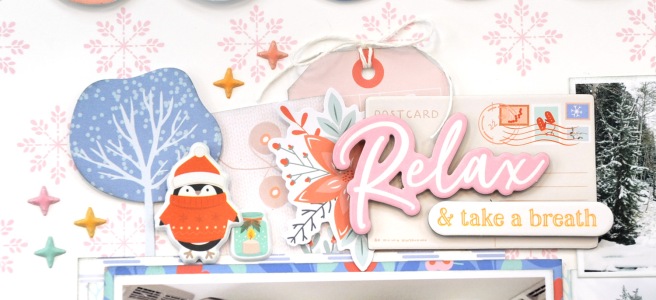
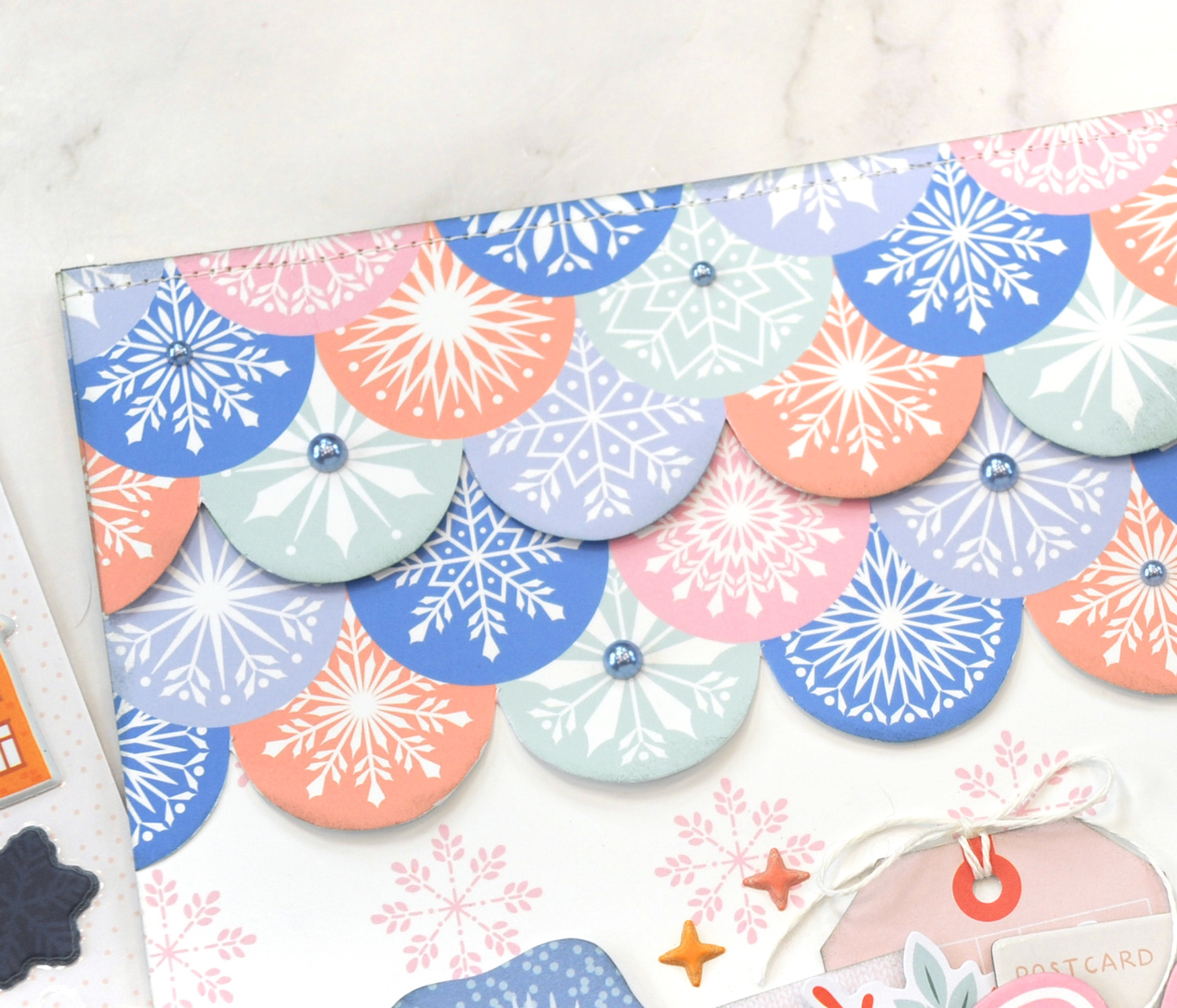
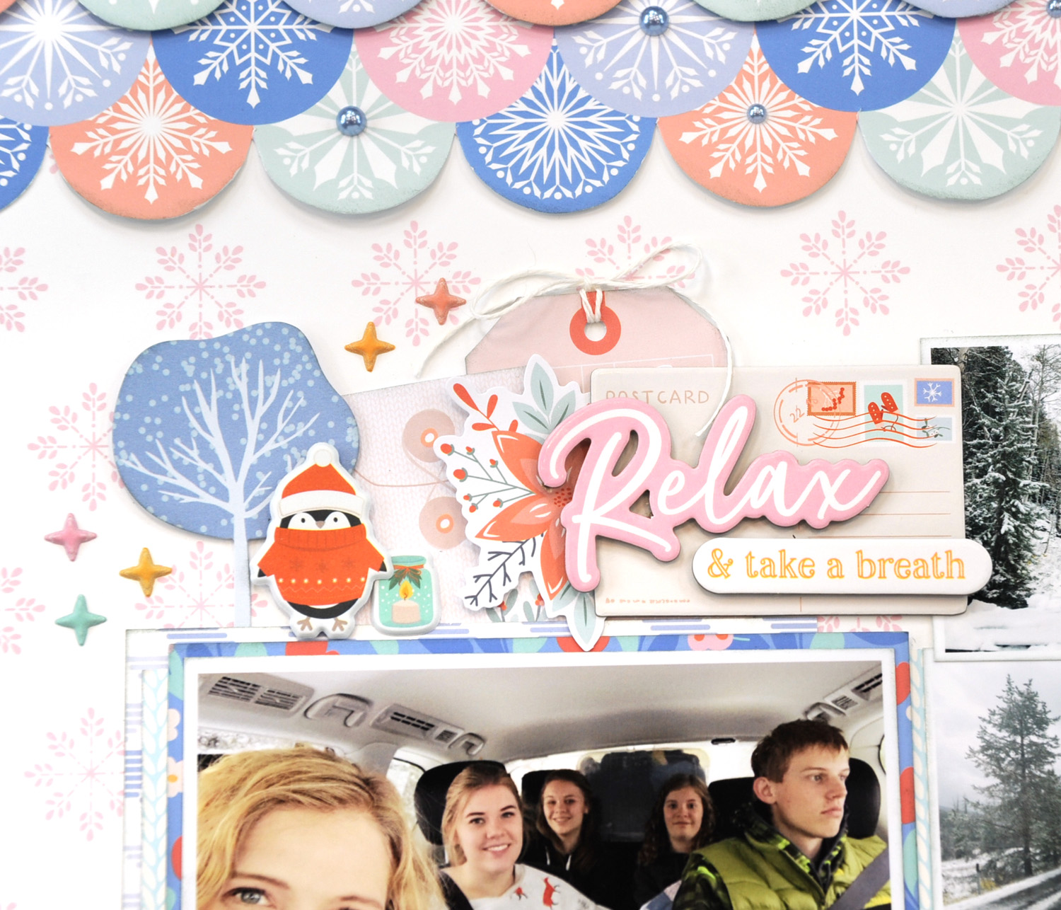
Today’s layout is all about snowflakes! I started with the adorable ‘Joy & Happiness’ pink snowflake paper as my base, then added in the ‘Full Heart’ scalloped snowflake paper as the highlight.
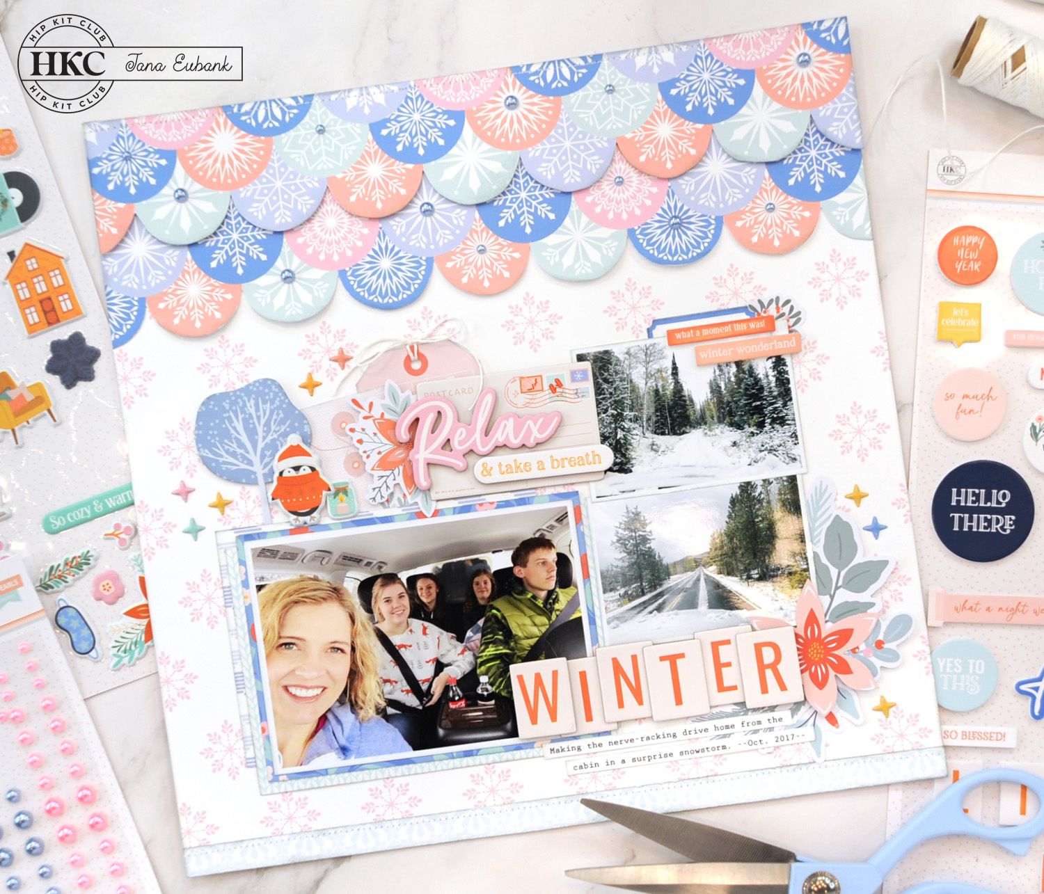
The minute I saw this snowflake scallop paper in the Main Kit I KNEW that I had to highlight it on a layout. I fussy-cut two sections of the paper, then overlapped them. I used small foam squares to lift the scallops up for a shadow effect. Even though I only used two portions, your eye automatically ‘thinks’ you’ve layered all of the scallops. I finished them off with a row of stitching across the top and randomly-placed blue pearl stickers (Embellishment Kit).
After I arranged my photos, I worked on a little winter scene to support them. I used the winter tree die-cut from the Main Kit then added the puffy penguin, candle, and sparkle stickers.
I used lots of the chipboard die-cuts on this page for the words and title. I LOVE the instant dimension chipboard adds to a project!
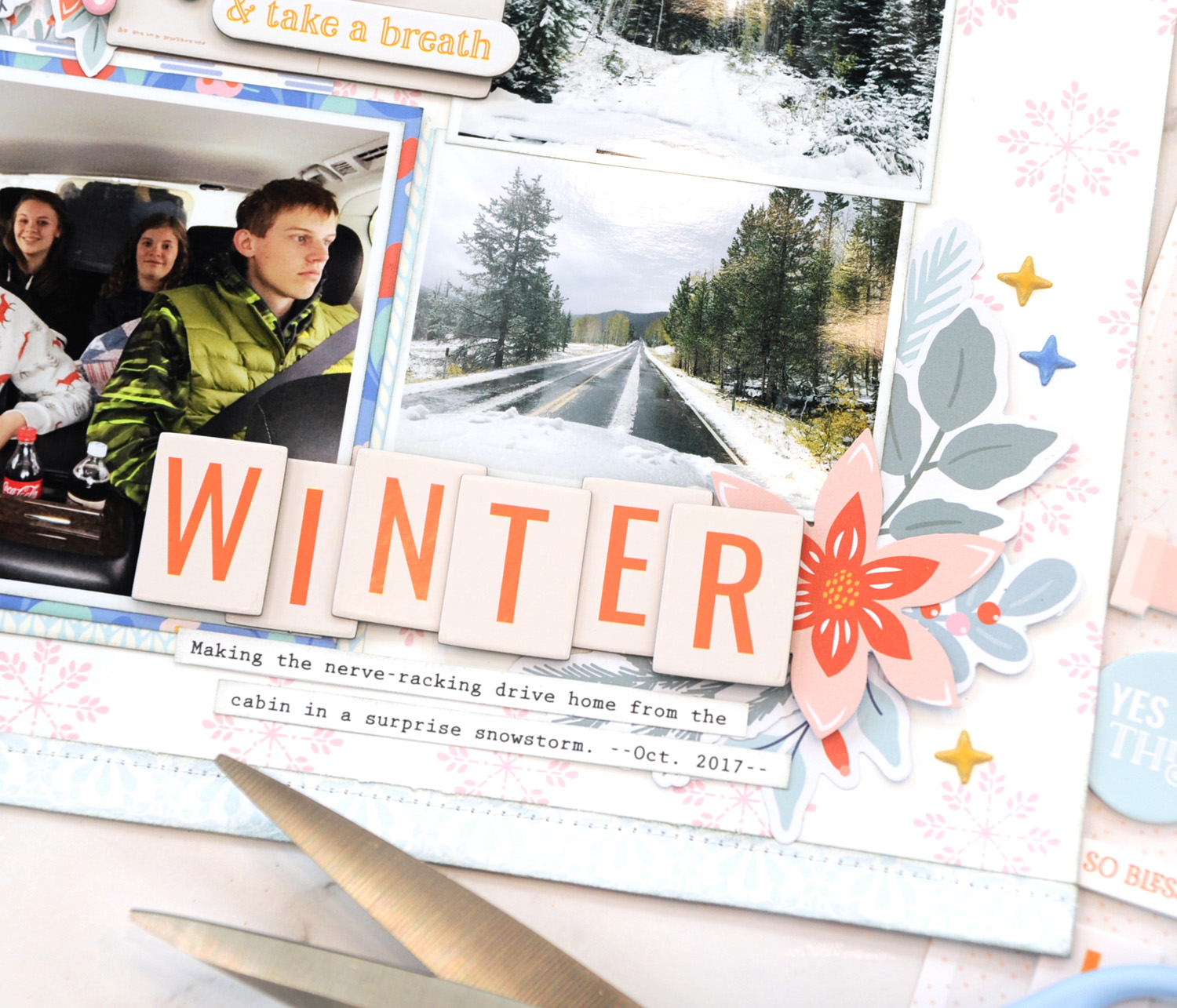
I accented the chipboard ‘WINTER’ title with an arrangement of the beautiful floral die-cuts from the Embellishment kit. I could play with florals all day. They make me so happy!
So, I’m wondering, are you more indoorsy or outdoorsy during the winter months? LOL!
Thanks for popping by today! Wishing you happiness in your creative journey!
DECEMBER 2023 HIP KITS USED IN THIS PROJECT:
- December Main Kit (Patterned Paper, Sticker Pack, Cardstock Die-cuts, Printed Foam Stickers)
- December Embellishment Kit (Chipboard Die-cuts, Puffy Shape Stickers, Floral Die-cuts, Pearl Stickers)
- December Pocket Life Kit (label die-cut)